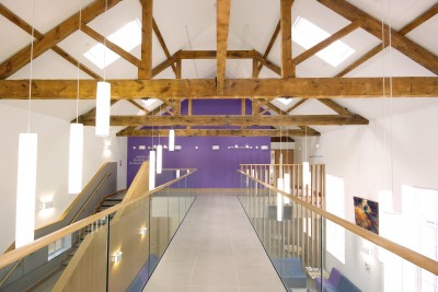
Fisherton House, Medical Centre

The judges were pleased to find that budget constraints had not led to purely utilitarian buildings, and that a considerable effort had clearly gone into combining fitness for purpose with making a genuine visual contribution to this part of the former Old Manor Hospital site. The use of two very different materials, a buff-coloured brick and white render, had worked well, enhancing the simple design approach, which derived from the Georgian tradition but without any extraneous details. The one conscious embellishment was the coloured strips on one side of each of the windows to the front of the building in white render, and these were felt to work extremely well, adding a certain panache to an essentially simple group of buildings. The former mental hospital ballroom had been successfully incorporated, both externally with the pharmacy added to it, and also internally. Here the retention of some full-height space at one end, with roof timbers exposed, kept some of the ballroom identity intact within its very different new use. The judges expressed the hope that a future budget might be found to add to the landscaping to further enhance the buildings’ setting, but overall their success in achieving the required facilities, while still making a strong visual impact on a very visible site, was felt to make them well worth an award.
